Twitter is not just a social media service, but also the name of an app. It used to be called Tweetie and the folks at Twitter liked it so much that they bought it. They re-branded the app after updating it and then also released a version for 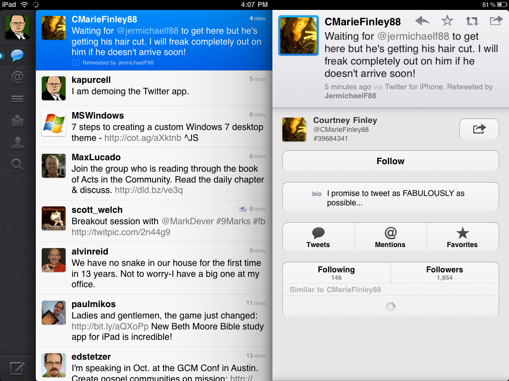 the iPad. It took the tech world by storm with a lot of people tweeting and writing about how great it is.
I’ve given it a try, and as I tweeted myself, I see why people like it, but I don’t see why they like it so much. I would never use the words incredible or awesome, which is what many said. Due to the attention it’s getting, I chose it as my iPad App of the Week. While I have recommended the previous iPad Apps of the Week, this one is not an endorsement, but a chance to show it to you since it received so much attention.
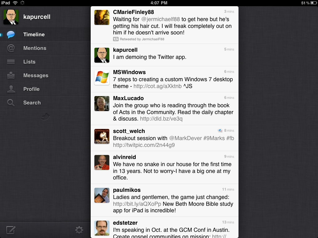
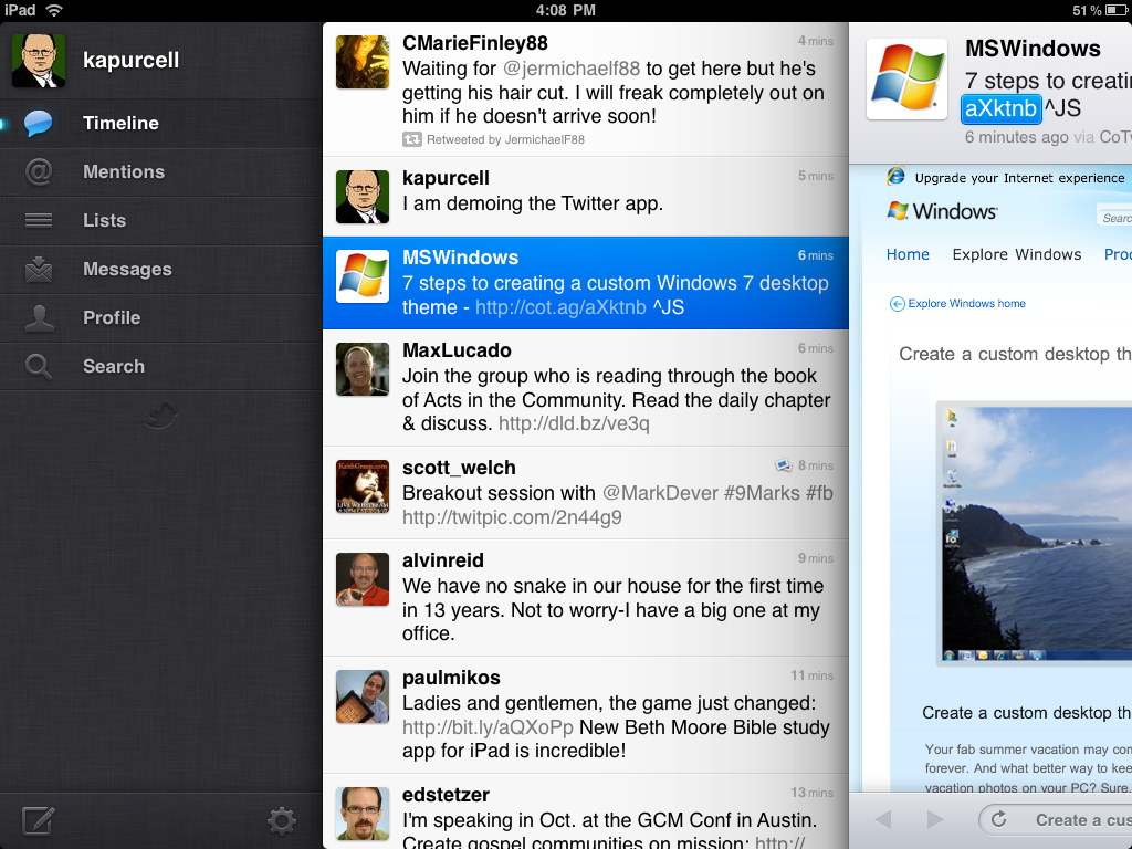
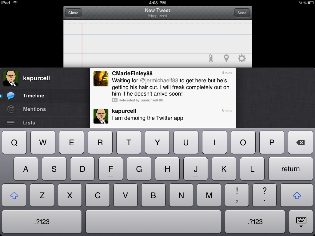
The interface of Twitter is simple. It works in both portrait and landscape, but I think most apps look best in landscape, including Twitter. In either mode it has a tree-style interface with folders along the left for the personal Timeline, Mentions of the user, Lists to which the user subscribes, Messages to or from the user, the user’s Profile and a button for Search. Under Profile the user can edit the profile, something not every app has. At the bottom of that left hand side is a button for composing a tweet and for settings.
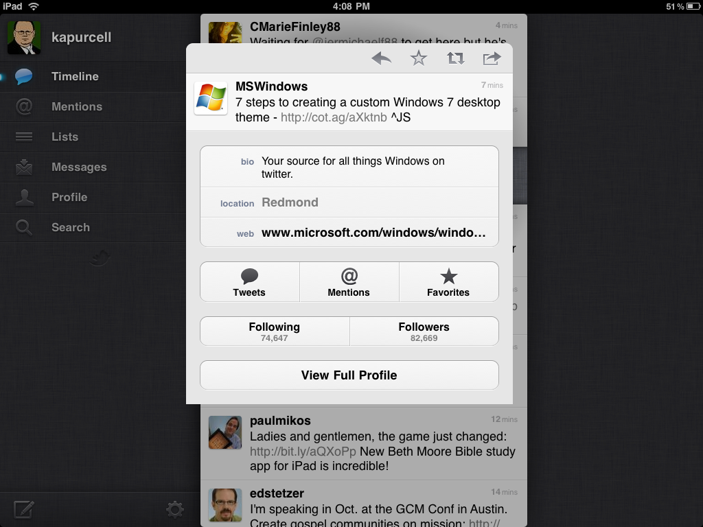
On the right side, the default view shows the user’s Timeline. This is a list of all the tweets from people the user follows. Each tweet can be tapped to open another column to the right of the main column of tweets. The look of this new column will depend on what is touched in the timeline. Tweets without anything but one user’s tweet, which display that person’s profile and their tweet above it. Below the profile is a list of similar profiles the user might want to follow.
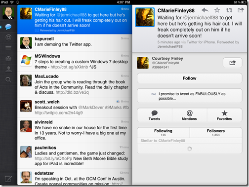
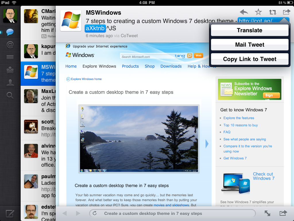
If a Tweet mentions another person, tap the name (@username) and the second column displays the tweet with the second person’s profile window below it. If the was part of a conversation, the full conversation will be displayed. Tap a tweet with an Internet link and the web site is displayed, like below.
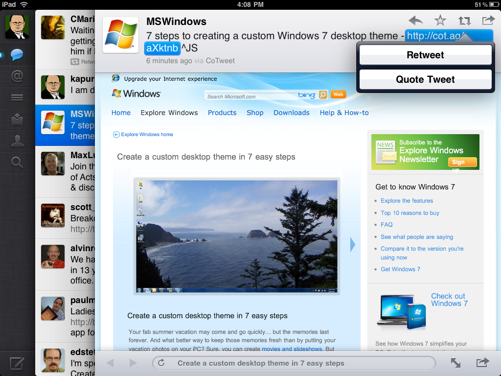
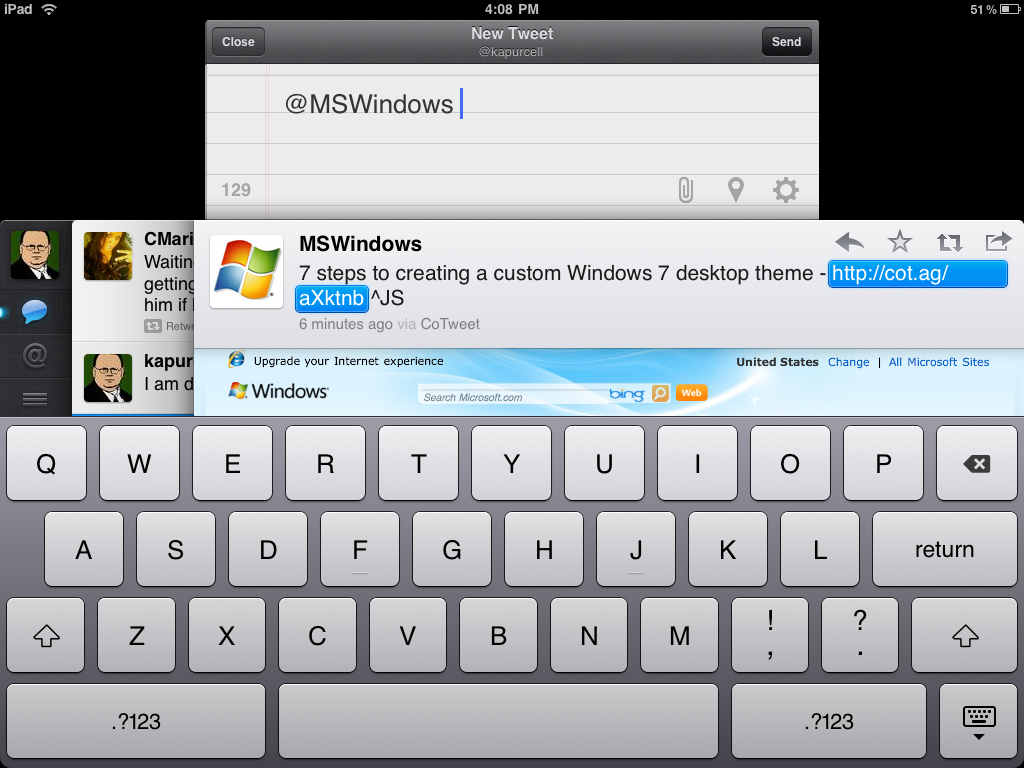
In each tweet there are toolbar buttons next to the person’s user name (see above). In order from left to right they are the Reply button, the Favorite button, the Retweet button and the Open button. Reply will either reply to the original tweeter or, if other user names are mentioned in the tweet, it will reply to all. The star turns it into a saved favorite tweet which then is added to your list on the Twitter page and any app that will support displaying those favorites, something the Twitter app does. The Retweet button will either retweet the tweet as it is or quote it so the user can add to it or edit out parts of it.
Twitter is a very good app, but it has a couple of problems. One thing that I find annoying is the way the second column, once opened, cannot be closed unless the user taps the other folders below the Timeline button. There needs to be a one tap way to make it go away entirely.
UPDATE: Thanks to a tip from @dcrfire, I now know that you can hid the extra column by tapping your own Twitter Profile Picture which is in the far upper left corner of the app. This removes one of my primary complaints and I am now actually using Twitter for iPad most of the time to read and update Twitter.
Another problem is that some of the ways users are expected to interact with the app are not very obvious. Pinching to open the Tweet window or doing a two finger swipe to open a conversation is never made clear. A button for each would be easier for users to find.
The last thing that I don’t like is the way the Twitter composition window looks like it is behind the rest of the interface.
These are mostly personal preferences. For me they are enough to make me hesitate in recommending the app. But I realize that they are not really flaws, which is why I chose to make this app my iPad App of the Week.
Twitter has some creative interface elements, like the moveable multiple columns and the way users can open a web site in the built-in browser with only one tap. The multiple columns also make good use of the space in landscape mode and nearly everything that you need to do to interact with the Twitter service is present in the app.
Pros:
- Unique interface
- One tap to open hashtag searches, user profiles and web links
- Multiple columns
- Complete Twitter service features included
Cons:
- Some features hard to find (UPDATE: case in point I didn’t find the fix for my original complaint listed directly below)
- Columns won’t easily go away when user is finished with them (UPDATE: This is not true; it goes away by tapping your own profile picture in the upper left corner)
- Composition window needs to be out in front when writing a tweet
Related Posts
-
While most people can access their email via the web these days, having a dedicated…
-
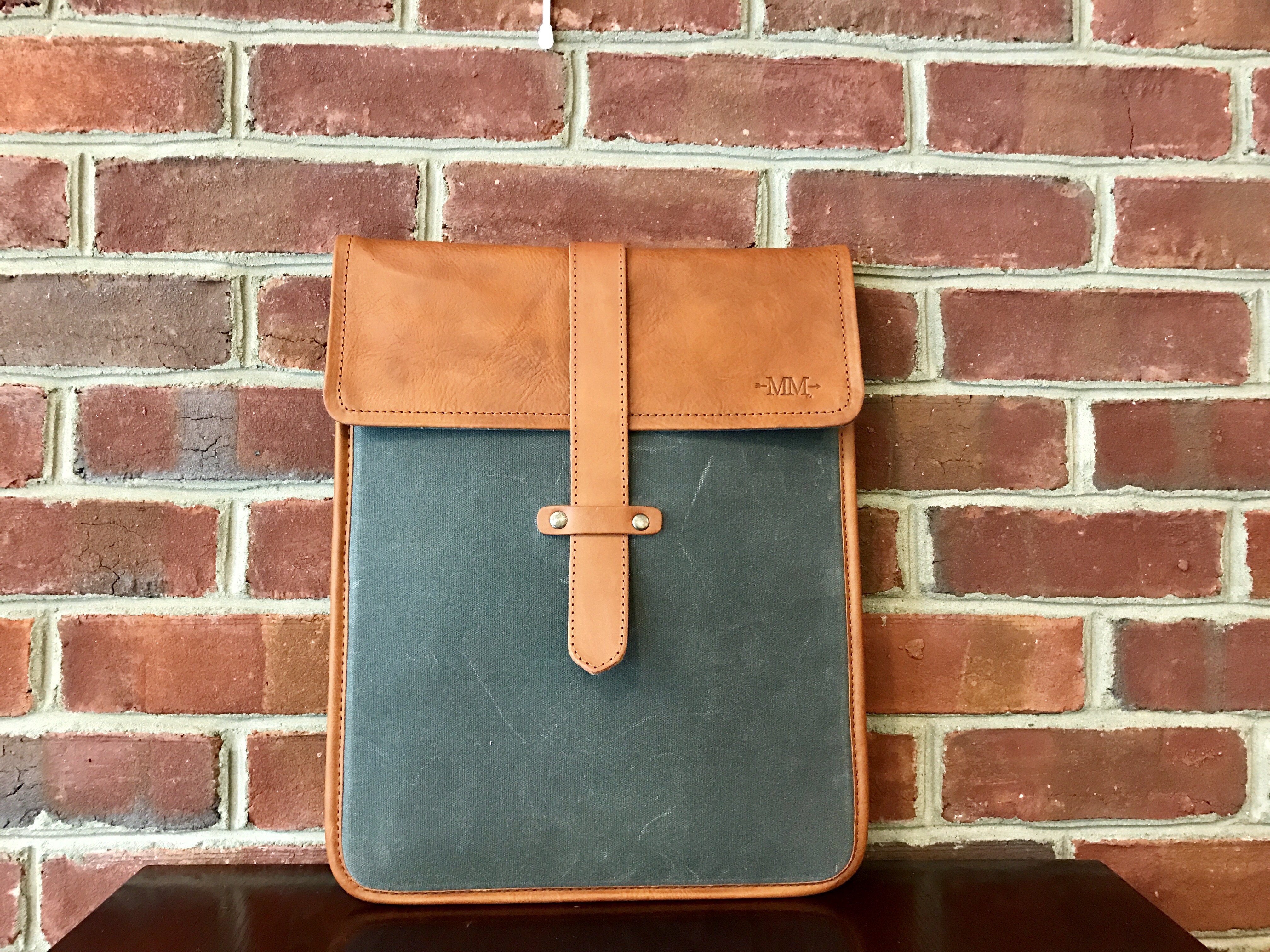
The Mission Mercantile Laptop Sleeve and Laptop Sleeve Vertical are a beautiful way to carry your…
-
Starting with OS X Mountain Lion, Apple introduced Gatekeeper so users couldn't easily install downloaded…