I installed Windows 8 Consumer Preview today and tested it out on my MacBook Pro via Parallels. If you own Parallels you can easily do the same by creating a new machine in the Parallels wizard. It includes the Windows 8 Consumer Preview as one of the optional operating systems.
After using the consumer preview of Microsoft’s new operating system, I decided that it really needs some work before I’d willingly upgrade. Based on how things went last time around with the public betas of Windows 7, I’m not going to hold my breath. We likely won’t see much change in the final version coming later this year.
With hope, I offer 8 things that Microsoft needs to fix in Windows 8.
Scrolling Vertically on a Mouse Wheel Moves the UI Horizontally

The new Metro UI scrolls horizontally. The more apps you load the longer it takes to get from the first to the last tile. If you use a trackpad on a notebook, then swipe horizontally and your screen moves to show apps to the right.
I hate trackpads so I plug in a mouse with a scroll wheel. It scrolls vertically. The Metro UI will scroll horizontally while I scroll my wheel vertically, but it feels wrong.
Accessing the Corner Popups

To access the recently run programs you can use the old favorite – ALT+TAB or WIN+TAB. But using your mouse or the trackpad you can move the cursor up to the upper left or lower left corners. Thumbnails of running apps or the start screen pop up.
I kept moving my cursor over the popup to click it in order to switch to that app or the Start screen. When you pull the cursor away from the corner the popup disappears. It drove me nuts till I figured out you don’t actually click the popup but in the corner. That’s counterintuitive!
Either push the popup all the way to the corner or let me click the icon. I still can’t get used to this strange behavior.

Powering Off Still Hidden
I thought Microsoft would learn from the mistakes of the Windows 95/98/XP/ME/Vista/7 Start menu. You have to click a bunch of times to turn off your system. I hoped that with a complete redesign, they’d change this and let me click once or twice at the most to power off my system. Instead, you have to click four times to shut it down using your mouse or touchpad.
Default Browser Lockdown
Apple doesn’t let anyone install a third-party browser in iOS as the default browser. You can’t add extensions or plugins to Safari either. It drives me nuts.
To grab market share away from Apple, Microsoft decided to let you add extensions to the Metro UI version of IE, right? WRONG! And you can’t install Chrome or Firefox on the Windows RT version at this point.
How stupid! Microsoft could solve an annoying iOS problem and thus potentially entice users over to their tablets. Missed opportunity!
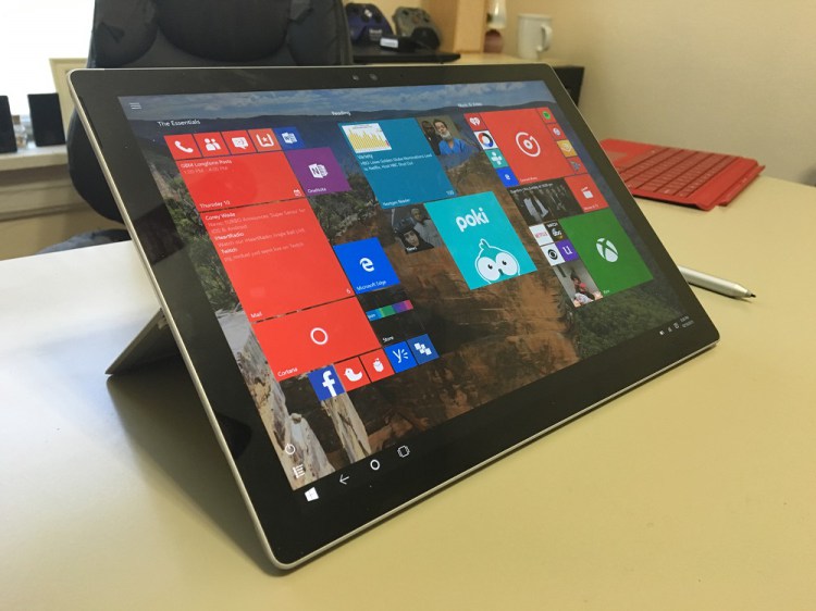
Desktop v. Metro UI
Right now there are few Metro UI apps. I understand its early. The fact that you can download any non-MS created apps is a good sign. My problem is the whole Desktop v. Metro UI interface inconsistency.

The Desktop, seen above, gives you a legacy interace that runs old apps not compatible with the Metro UI, in other words all of my software. We’re caught in a trap. Developers won’t upgrade their apps to Metro UI until they know plenty of users will pay and users won’t move to Windows 8 till they can get their apps to run well in it.
You can run legacy apps just fine, but it will feel like you’re moving to another interface. It reminds me of running Windows on a Mac. I hate when I need to switch to run the one or two Windows applications I can’t get on my Mac.
Microsoft took a gamble with this UI switch. I just wish they offered a better way to run older apps.
Option for Desktop as Default
Give users the option to set the Desktop interface as default. This would solve the above problem for business or power users. It delays the move to the Metro UI, but until the Metro UI matures these kinds of users will delay buying Windows 8.
Windows ReTweet? Run-Time or Really Terrible?
Microsoft named their tablet version of Windows 8. They will call it Windows RT. What does the RT stand for? If anyone knows they aren’t telling us. It’s a terrible name. Why not Windows 8 for the desktop or laptop and another name for the Windows tablet version, like Windows 8T or Windows Tablet. I like Windows Metro.
Forcing Tablet Interface on PC Users
There’s an underlying issue behind most of these problems. Windows 8 look like they designed it for tablets. Microsoft wants one interface for all devices, but that’s foolish. Tablets behave different than laptops. Phones are another thing. Why can’t we have an interface designed with each tool in mind? Why must they all look exactly alike. Apple’s going down this stupid road too with the convergence of OS X and iOS. I don’t think either one will work well.
—
What would you change with Windows 8?
Related Posts
-
Microsoft’s Windows operating systems let users do a lot of things. Every day, machines loaded…
-

Even though Windows 10 has made upgrading Windows easier than ever, sometimes you still need…
-
On August 2, 2016 the Windows 10 Anniversary Update came out with some cool new features…