Charts help people process data, and Microsoft Excel can build a variety of charts with your data. Bar charts, area, column, and pie charts commonly get used to represent data visually. Each chart type has its own set of options and variations and can exist as an embedded object in the spreadsheet with your data or in a separate sheet.
Chart Jargon
Charts have certain terms associated with them. Understanding these commonly used words makes for building great charts:
Links: the data points used to create the chart. They are dynamically linked to the chart, so if the data points change, the chart also changes accordingly.
X-Axis: the x-axis is the horizontal line at the bottom of a line or bar graph, it is also called the category line.
Y-Axis: the value axis of Y-Axis is the vertical line on the left, to which to which the value of data is plotted.
Example 1
Example 2
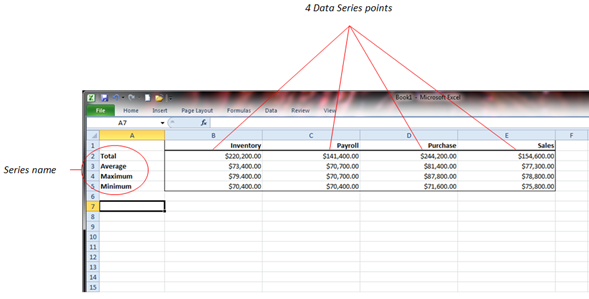
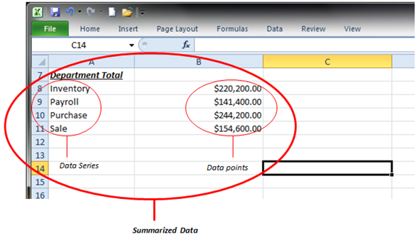
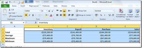
Data series/Data Points: in the screenshot above are examples of data series and data points. With pie charts, you have one data point for each data series. Bar and line charts can have up to 255 data series and up to 32,000 data points for each data series. The above screenshot has four data series (total, average, maximum, minimum). Each data series has four data points.
Title: Titles appear to the left of the Y-Axis, beneath the X-Axis and at the top of the chart.
Legend: The legend identifies each of the data series.
Creating Charts
Now lets create some charts!
Pie Charts
The first chart we will create is a Pie chart summarizing the data in Example 2.
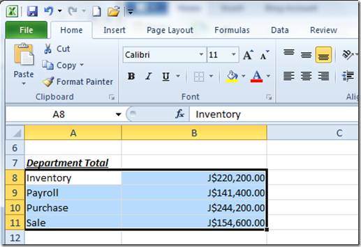
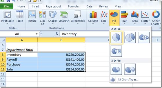
Start by blocking (highlighting the data, or selecting it, with the mouse) from cell A8 to B11 as shown above.
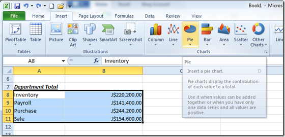
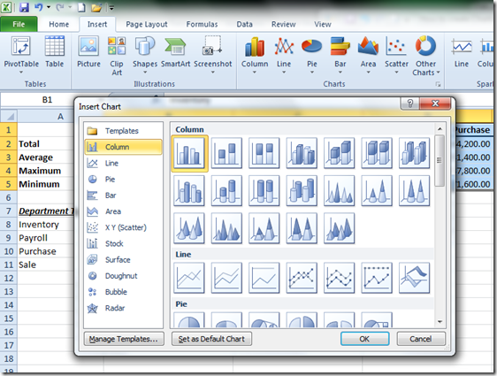
Click on the Insert tab and click Pie in the Charts group.
The Pie gallery displays different types of pie charts available in 2-D and 3-D. For our first chart, select the first pie and click it.
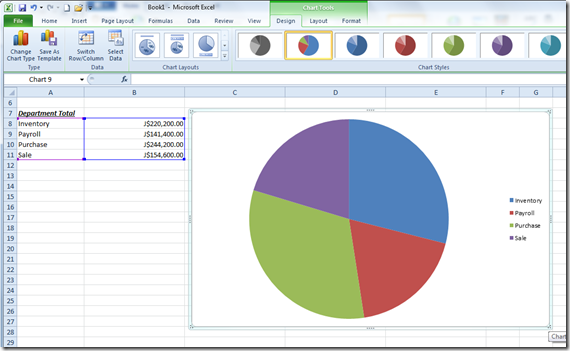
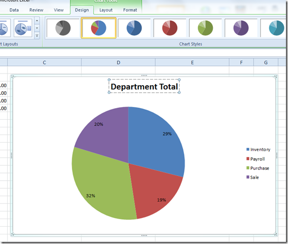
This will insert an embedded chart as shown above in the spreadsheet. As you can see, our pie chart is quite basic, simply displaying 4 data points in color along with a legend at the side. Lets display more information in our chart.
You will notice that Excel displays some contextual tabs related to Chart Tools. This will give us additional options to emphasize our chart.
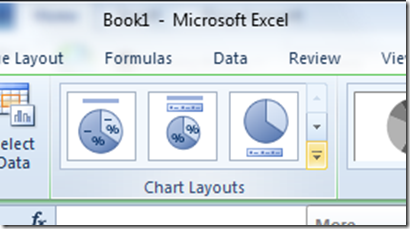
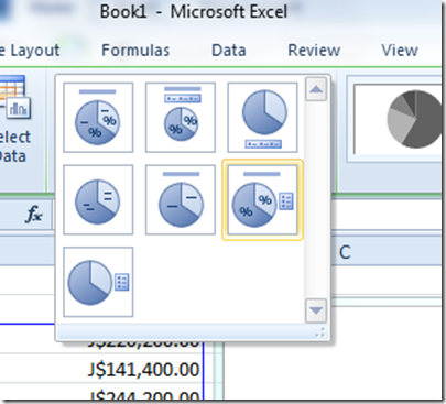
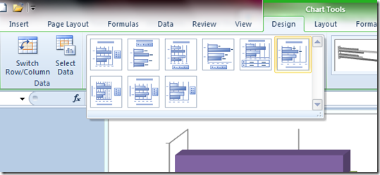
On the Design tab in the Chart layouts group there are additional options available for displaying more information about the chart. Click the More button to reveal additional chart options.
Click on Layout 6. This will display more information, such as the percentage, along with a Title Bar.
As you can see our chart displays more information, which will help to give us better insight. You can click the title and edit with information about the chart.
There you have it: your first Pie Chart.
Bar Charts
If you want to compare multiple values, bar charts are highly recommended. Let’s take a look at how to do that. Earlier we had talked about Data points. In this particular chart we will be comparing information from four different data points instead of just one (which is what we did with the pie chart).
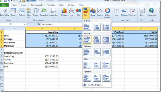
Highlight the information just like we did in the pie chart, then go to the Insert tab and click the Bar button. This will display a gallery of different types of bar charts.
Let’s try one of the 3D Bar charts. Click the first 3D bar chart in the gallery.
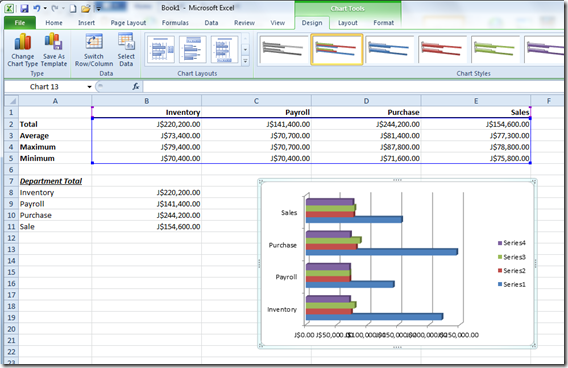
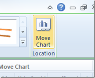
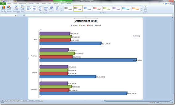
Our chart is displayed successfully, but it’s a bit squished, because we are displaying a lot of information. A chart like this would be best displayed in its own sheet where we can clearly visualize all the information. To do that, click on the chart, then click the Move Chart button in the Location group.
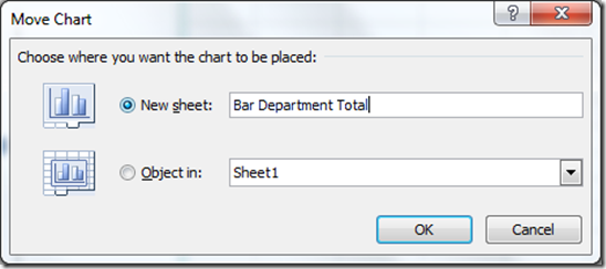
This will bring up the Move Chart dialog:
Select the option New sheet: (you can give the sheet a name in the process). Click OK.
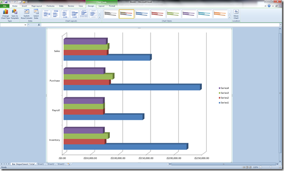
Our bar chart looks much better this way. If you want, you can change the chart layout and add a title and additional information representing each bar.
There you have it: your first bar chart.
You can experiment with other chart types available in Excel: Column, Line, Area, X Y (Scatter), Stock, Surface, Doughnut, Bubble and Radar. Be careful to use charts according to the data types, though. Simple information doesn’t necessarily require a bar chart ,as we created above, so focus on making the information easy to understand first.
